Our Icon: A Closer Look
Clients often establish relationships with agencies that see their challenges and opportunities a little bit differently. There’s nothing curious about that. Effective brand and product communications are rooted in specificities and details, in scene setting and empathetic understanding of both client and audience characters.
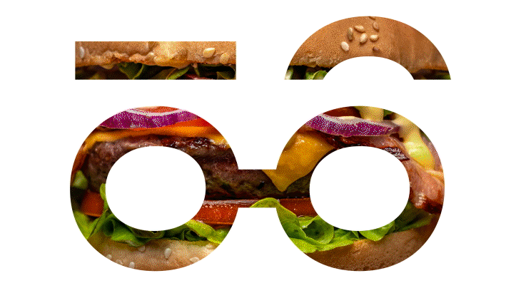
The icon in our new logo defines our character as an agency. It represents our team’s curiosity and reflects a sense of keen-eyed observation we’ve heard is unique in the ag and food categories that are our areas of focus.
“Once we had an intriguing new name for the agency, we needed a mark that lived up to it,” explains Senior Vice President, Creative Lead, Matt Lunneborg. “Any new mark had to communicate curiosity and be pleasing to the eye. Too many companies expect their marks to communicate an entire book’s worth of ideas. We knew our new mark would stand out if it evoked one idea in a simple, effective way. That’s the strength of what Madi developed.”
How you view the world determines how you tell stories. At Curious Plot we’re always on the lookout for new potentials and possibilities because what’s worked in the past is never a promise of continued success.
Our roots in agriculture and curious obsession with consumer food choices give us a perspective and expertise no other agency partner can offer. On behalf of and in collaboration with our clients, our work helps to contribute to a common understanding and implications of the major long-term trends in the food and agricultural systems.
In agriculture that means we understand there’s more to a successful season than just harvest. We help ag clients market and communicate to an array of stakeholders with uniquely diverse priorities. Likewise, our team is filled with devoted foodies whose oxygen is discovering the latest culinary trend. That passion carries directly over into the work we cook up for our food clients.
Art Director Madi Kurvers created the new Curious Plot icon. “I loved the type face I was working with for the word mark, so I wanted to see what I could make using elements of the letter forms. The eyes, for instance, were made using the letter O. I kept playing around until I’d made something that illustrated our curiosity as an agency. We’ve been able to do so much with it, which is also exciting.”
See the difference.
Our site’s case studies demonstrate what successful client marketing and communications look like to us. What these various projects all have in common is a clarity of message and meaningful results that can only come from a clear strategic vision at the start.
“What you see is what you get” is another way of putting it. You have to look closer early on to see further than others have seen. That’s the thinking behind the icon in the Curious Plot logo. Imagine the point of view we bring to our clients’ communication objectives.
![]()